The Blizzard of Bogus Journalism on Covid Jeffrey A. Tucker
https://www.aier.org/article/the-blizzard-of-bogus-journalism-on-covid/
This game of hunt-and-kill Covid cases has reached peak absurdity, especially in media culture.
Take a look at Supermarkets are the most common place to catch Covid, new data reveals. It’s a story on a “study” assembled by Public Health England (PHE) from the NHS Test and Trace App. Here is the conclusion. In the six days of November studied, “of those who tested positive, it was found that 18.3 per cent had visited a supermarket.”
Now, if the alarm bells don’t go off with that one, you didn’t pay attention to 7th grade science. If the app had also included showering, eating, and breathing, it might have found a 100% correlation. Yes, the people who tested positive probably did shop, as do most people. That doesn’t mean that shopping gives you Covid and it certainly doesn’t mean that shopping kills you.
Even if shopping is a way to get Covid, this is a very widespread and mostly mild virus for 99.8% percent of the population with an infection fatality rate as low as 0.05% for those under 70. Competent infectious disease experts have said multiple times that test, track, and isolate strategies are nearly useless for controlling viruses such as this.
This story/study was so poor and so absurd that it was too much even for Isabel Oliver, Director of the National Infection Service at Public Health England. She sent out the following note:

Thank you. One down, a thousand to go.
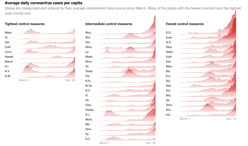
The New York Times pulled a mighty fast one with this piece: “States That Imposed Few Restrictions Now Have the Worst Outbreaks.” This would be huge news if true because it would imply not only that lockdowns save lives (which no serious study has thus far been able to document) but also that granting people basic freedoms are the reason for bad health outcomes, an astonishing claim on its own.
The piece, put together by two graphic artists and seemingly very science-like, speaks of “outbreaks,” which vaguely sounds terrible: packed with mortality. It’s odd because anyone can look at the data and see that New York, New Jersey, Massachusetts, and Connecticut lead the way with deaths per million, mostly owing to the fatalities in long-term care facilities. These were the states that locked down the hardest and longest. Indeed they are locking down again! Deaths per million in states like South Dakota are still low on the list.
How in the world can the NYT claim that states that did not lock down have the worst outbreaks? The claim hinges entirely on a trivial discovery. Some clever someone discovered that if you reflow data by cases per million instead of deaths per million, you get an opposite result. The reasons: 1) when the Northeast experienced the height of the pandemic, there was very little testing going on, so the “outbreak” was not documented even as deaths grew and grew, 2) by the time the virus reached the Midwest, tests were widely available, 3) the testing mania grew and grew to the point that the non-vulnerable are being tested like crazy, generating high positives in small-population areas.
By focusing on the word “outbreak,” the Times can cleverly obscure the difference between a positive PCR result (including many false positive and perhaps half or more asymptomatic cases) and a severe outcome from catching the virus. In other words, the Times has documented an “outbreak” of mostly non-sick people in low-population areas.
There are hundreds of ways to look at Covid-19 data. The Times picked the one metric – the least valuable one for actually discerning whether and to what extent people are sick – in order to generate the result that they wanted, namely that open states look as bad as possible. The result is a chart that massively misrepresents any existing reality. It makes the worst states look great and the best ones look terrible. The visual alone is constructed to make it looks as if open states are bleeding uncontrollably.

How many readers will even know this? Very few, I suspect. What’s more amazing is that the Times itself already debunked the entire “casedemic” back in September:
Some of the nation’s leading public health experts are raising a new concern in the endless debate over coronavirus testing in the United States: The standard tests are diagnosing huge numbers of people who may be carrying relatively insignificant amounts of the virus.
Most of these people are not likely to be contagious, and identifying them may contribute to bottlenecks that prevent those who are contagious from being found in time….
In three sets of testing data that include cycle thresholds, compiled by officials in Massachusetts, New York and Nevada, up to 90 percent of people testing positive carried barely any virus, a review by The Times found.
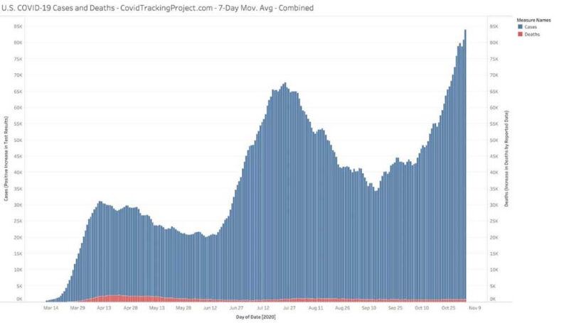
All of which makes one wonder what precisely is going on in this relationship between cases and severe outcomes. The Covid Tracking Project generates the following chart. Cases are in blue while deaths are in red.

Despite this story and these data, the graphic artists at the Times got to work generating a highly misleading presentation that leads to one conclusion: more lockdowns.
(My colleague Phil Magness has noted further methodological problems even within the framework that the Times uses but I will let him write about that later.)
Let’s finally deal with Salon’s attack on Great Barrington Declaration co-creator Jayanta Bhattacharya. Here is a piece that made the following claim of the infection fatality rate: “the accepted figure of 2-3 percent or higher.” That’s an astonishing number, and basically nuts: 10 million people will die in the US alone.
Here is what the CDC says concerning the wildly disparate risk factors based on age:

These data are not inconsistent with the World Health Organization’s suggestion that the infection fatality rate for people under 70 years of age is closer to 0.05%.
The article further claims that “herd immunity may not even be possible for COVID-19 given that infection appears to only confer transient immunity.” And yet, the New York Times just wrote that:
How long might immunity to the coronavirus last? Years, maybe even decades, according to a new study — the most hopeful answer yet to a question that has shadowed plans for widespread vaccination.
Eight months after infection, most people who have recovered still have enough immune cells to fend off the virus and prevent illness, the new data show. A slow rate of decline in the short term suggests, happily, that these cells may persist in the body for a very, very long time to come.
How is it possible for people to make rational decisions with this kind of journalism going on? Truly, sometimes it seems like the world has been driven insane by an astonishing blizzard of false information. Just last week, an entire state in Australia shut down completely – putting all its citizens under house arrest – due to a false report of a case in a pizza restaurant. One person lied and the whole world fell apart.
Meanwhile, serious science is appearing daily showing that there is no relationship at all, and never has been, between lockdowns and lives saved. This study looks at all factors related to Covid death and finds plenty of relationship between age and health but absolutely none with lockdown stringency. “Stringency of the measures settled to fight pandemia, including lockdown, did not appear to be linked with death rate,” says the study, echoing a conclusion of dozens of other studies since as early as March.
It’s all become too much. The world is being seriously misled by major media organs. The politicians are continuing to panic and impose draconian controls, fully nine months into this, despite mountains of evidence of the real harm the lockdowns are causing everyone. If you haven’t lost faith in politicians and major media at this point, you have paid no attention to what they have been doing for the better part of this catastrophic year.
Comments are closed.
